
Earthscope
Let the ripple begin
Challenge
Help two widely respected science organizations merge under a new name and visual identity.
Solution
Comprehensive process to build consensus for a new identity and brand language.
Outcome
A beautiful new logo and brand guidelines that help tell the two organizations’ shared story.
CHALLENGE
Challenge
Help two widely respected science organizations merge under a new name and visual identity.
SOLUTION
Solution
Comprehensive process to build consensus for a new identity and brand language.
RESULT
Outcome
A beautiful new logo and brand guidelines that help tell the two organizations’ shared story.
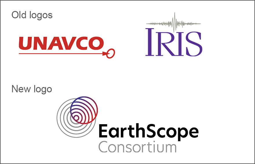
UNAVCO and IRIS both got their start in the early 1980s. Both were consortia of academic institutions from across the U.S. And both studied all things Earth — earthquakes, glacial melt, atmospheric shifts, you name it — by contracting with the likes of NSF, NASA and the USGS to operate research facilities and release extensive scientific data and research findings. Over time, their missions and work intersected more and more. And in 2021, at the behest of funders, they decided to merge. The epicenter of the merger? A complete rebrand.
UNAVCO and IRIS were large organizations, each working with hundreds of scientists and geophysics experts around the world. We needed to not just create a new logo, but to also use the process to bring the organizations together and help build consensus. To do that, we facilitated a virtual work session with the leadership team to identify the core ideas the new identity needed to convey, as well as preferences for logo archetypes, fonts and colors. We then validated that direction with a survey across their broad constituencies.
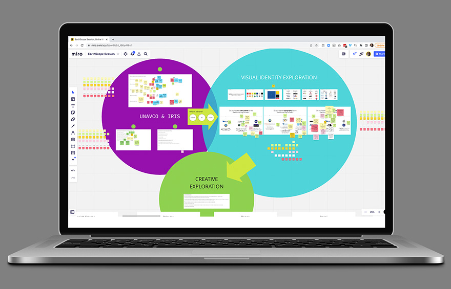
From there, we worked to create both a visual and verbal identity. Initial designs covered a large range of options and explored different ways to present the name itself. On the verbal side, we hewed close to the work of the Consortium, pulling ideas from each organization’s mission, vision and values and framing them together in the language of geodesy and earth science.
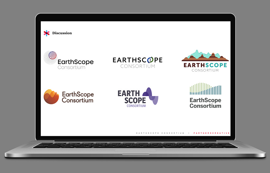
Ultimately, the selected logo features a striking concentric circle icon representing both the type of science EarthScope conducts and the way it pushes out data and insight as an organization. The color palette is drawn from the original colors of the two organizations to represent their individual heritage and combined expertise. And we added the word Consortium to the official name to indicate the collaborative nature of the work conducted.
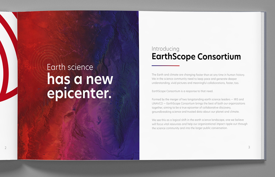
A complete set of brand guidelines was built out around the new identity, including verbal guidelines for brand positioning and communication. The identity was introduced across the organization to rave reviews and then officially rolled out in mid-December 2022 when the two entities completed their merger.
home
run
You all have done really remarkable work. It has been a great pleasure to work with you all on giving EarthScope an identity. And anecdotally, our goal of using this exercise to engage with our community is a home run.


15
Number of logo designs generated at the concept stage.
2022
Official merger and launch of the new EarthScope Consortium name and identity.
205
Number of constituents who weighed in on the brand identity survey.